Living Data
Science Art & Talks
The experiential process of observation and reflection is key to art and science
and is an essential component in understanding interdependence
of all species and ecosystems, terrestrial and aquatic.
Paul Fletcher Animator
Science Art & Talks
Living Data Program for the 2013 Ultimo Science Festival, Sydney, September 12-21.
When I Was a Buoyant Photographic projections by Josh Wodak
New meaning is attached to a simple gesture.
Predicted sea level rises are modelled as data (collected from 1929) projected onto people.
Data are digitally projected onto people to relate the hockey stick rise to a simple human gesture.

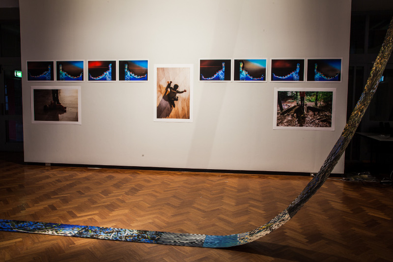
Josh Wodak. When I was Buoyant installation, Sydney College of the Arts, University of Sydney, Rozelle campus, 2013

Josh Wodak. When I was Buoyant Photograph, 2012
The Hockey Stick climate graph is aligned with the contours of our human form.
When I Was a Buoyant, is part of Good [Barrier] Grief, a series of photo-portraits with sea height levels digitally projected on to bodies to represent future sea level rise. It was produced through an Artist Residency at Marrickville Council, Sydney, with all the portrait subjects being volunteers from the local community. Each participant stares directly into the camera in a 'best case'/daytime/exterior and 'worst case'/nighttime/interior setting. The interior setting depicts future sea level rise should global temperatures increase more than two degrees by 2028. The exterior setting depicts future sea level rise should global temperatures increase less than two degrees by 2028. In both settings a century of sea levels (1929 to 2028) are mapped onto the arms+head of the subject, to illustrate the parallels between the Hockey Stick climate graph and the contours of a human body when one's arm is stuck out horizontally. The Hockey Stick graph shows average Northern Hemisphere temperatures for the last millennium with an exponential increase from the beginning of the 20th, like the shape of a hockey stick. When I Was a Buoyant concerns aging (as in as 'worry lines' and 'lines of age'), nostalgia (for one's childhood) and the twin meanings of buoyancy: staying afloat and being optimistic.
For /When I Was A Buoyant/I researched climate change science from relatively detached reports of IPCC, UN, IEA, OECD, World Bank et al, to relatively engaged and empassioned pleas and calls for action in more personal accounts provided by scientists who have reached out to the general public, such as Dr. James Hansen and Dr. Tim Flannery.
These 'detached'/objective and 'engaged'/subjective approaches to communicating climate change came together for me when watching Professor Will Steffan, head of the ANU Climate Institute, open an art exhibition on climate change at ANU in 2012. He mentioned an illustrative graph his colleague Professor Lesley Hughes had made. Will described it as Lesley's 'personal' illustration she uses in her climate change presentations, to show average global temperatures in her lifetime, versus anticipated temperatures in her children's and her grandchildren's lifetime.
I wrote to Lesley to ask for a copy of her illustration, as it sought to address the combined 'detached' and 'engaged' graphs I projected onto portrait subjects' bodies in /When I Was A Buoyant/. Lesley then opened the first exhibition of /When I Was A Buoyant/, which was a wonderful way to close the loop between what I draw from climate scientists, and what I try and offer them, and the public, in my artistic representations of climate change.

Josh Wodak
I am an interdisciplinary artist and researcher whose participatory projects and interactive installations explore ecological sustainability and environmentalism. Formally trained in Visual Anthropology (University of Sydney) and Media Arts (Australian National University), my work has been presented as performances, screenings, installations and exhibitions in art galleries, museums, theatres, performative spaces, cinemas, and festivals across Australia. My ongoing body of work, Good [Barrier] Grief (2011- present), uses participatory practice in photomedia, video art, sound art and interactive installations to explore participants' and audiences' understanding of the consequences of different climate change trajectories and the role of their actions in directing these trajectories.
Josh WodakJosh Wodak 2013
Notes for exhibition designers:
The animation will be screened from the data projector mounted in the ceiling in the far eastern bay of The Muse,
The woven strip of printed paper may be place (as in the photo above) along the central corridor. Note that this work is fragile.
Josh Wodak, Artist/Academic, Australia
What do you most value about our work?
I most value how Living Data brings critical engagement across diverse
artforms that all are responding to climate change, and how it fosters
dialogue between climate scientists and artists working on climate change.
What have you contributed?
I have contributed a new work /When I Was A Buoyant v2/ made
specifically for Living Data 2013, and I gave a talk on the panel about
'how we act on what we measure' about my work on climate change.
How have you benefited?
I have most benefited by meeting other artists working on climate change
and seeing their work in person, and in particular meeting climate
scientists as dialogue and collaboration with cliamte scientists is
integral to my pratctice
How could the Living Data program be improved?
One suggestion I have is to combine all the panels into a day long
symposium, rather than have them on separate days, so that there is more
chance for dialogue between attendees.
Also, although The Muse is a very nice gallery, it seemed that more
engagement with UTS staff and students would happen if it was staged on
UTS campus, to attract passing foot traffic.


